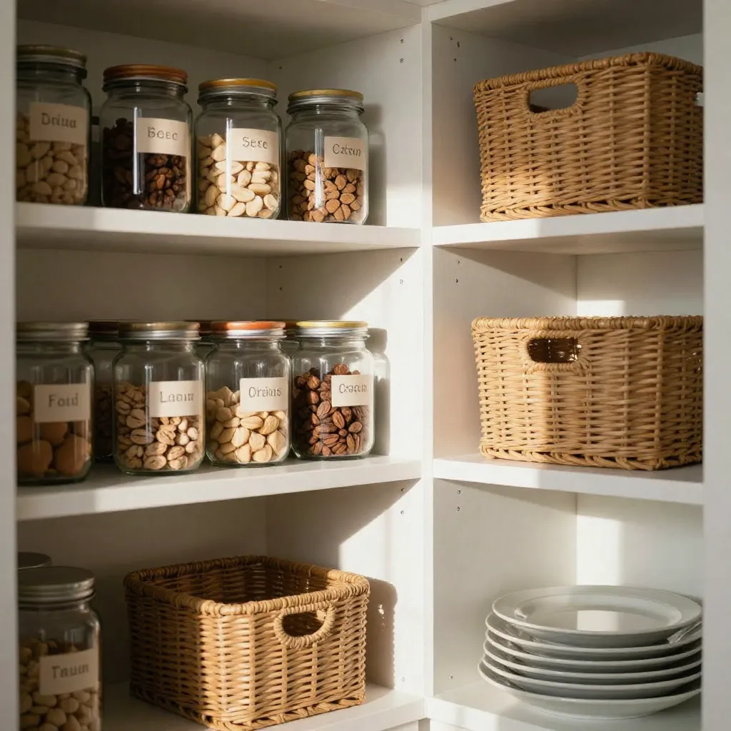
Taxonomy Architecture
Our labeling system uses a hierarchical visual taxonomy. Each category has a unique icon and color signature, creating immediate visual recognition.

Protein Category
Icons represent different protein sources: legumes, nuts, seeds, and grains. Color coding distinguishes between raw and processed items.
Icon Set: 12 variations

Grain Classification
Visual markers differentiate between whole grains, flours, and processed grain products. Each type has a distinct geometric pattern.
Icon Set: 8 variations

Acid & Spice Markers
Specialized icons for vinegars, citrus products, and spice blends. Color intensity indicates flavor profile and usage frequency.
Icon Set: 15 variations
Label Structure
Primary Identifier
The main icon represents the ingredient category. Size and placement ensure visibility from a distance while maintaining aesthetic balance.
Standard size: 24x24mm
Text Information
Clear typography displays ingredient name, purchase date, and expiration information. Font choice prioritizes readability.
Font: Modernist Sans, 10pt
Color Coding
Background colors indicate category membership. Subtle gradients provide visual depth without compromising readability.
Color palette: 6 base colors
Status Indicators
Small markers show freshness status, quantity level, and rotation priority. These elements update as inventory changes.
Indicator types: 3 variations
Application Process

Inventory Cataloging
All existing items are cataloged and assigned appropriate category codes. This creates the foundation for the labeling system.

Label Production
Custom labels are printed using durable materials resistant to moisture and handling. Adhesive quality ensures long-term adherence.

Systematic Application
Labels are applied following the established taxonomy. Placement is standardized for consistency across all containers.

